Hugo Award Logo Designs
2009
The Contest
The World Science Fiction Society has been awarding trophies for Science Fiction and Fantasy since 1953. But, until 2009, the Hugo Awards did not have an identifying logo. It was in that year they held a world-wide open competition to design a logo.
The rules were simple: The winning design would have the signature four-finned Hugo Award rocket, and the words "Hugo Award". They also asked for a variant with the word "Winner".
Doug Keith, an accomplished children's book illustrator, suggested that we collaborate on creating an entry for the contest. I met Doug in a game animation class in Seattle. Among Doug's many artistic talents, he is an experienced logo designer. So, I jumped at the chance to work with him on such a fun project. With his expert artistic and graphic design ability, and my passion for retro-style rockets, how could we lose?
The contest allowed up to three separate designs to be submitted. Doug and I put most of our effort into the first entry (Concept 1). We spent about a week trying out a few alternative concepts. We combined our favorite parts from each one, then worked the final design pretty hard for another two weeks.
With only a few days left before the deadline, I came up with two additional quick designs to supplement our first one. The designs use a much simpler graphic approach compared to our first design. They add very little beyond the required elements of the rocket and "Hugo Award" text. Ultimately, the judges chose a design even simpler than these.
Although none of our designs were ultimately chosen, it was a valuable experience and we were pleased with our efforts. In total, there were 390 entries by 215 different people from 24 different countries. The Hugo Award logo judges stated that they "were impressed with the standard of submissions, and of the many very different conceptions of the award.", and that "deciding on a winner proved very difficult."
Concept 1
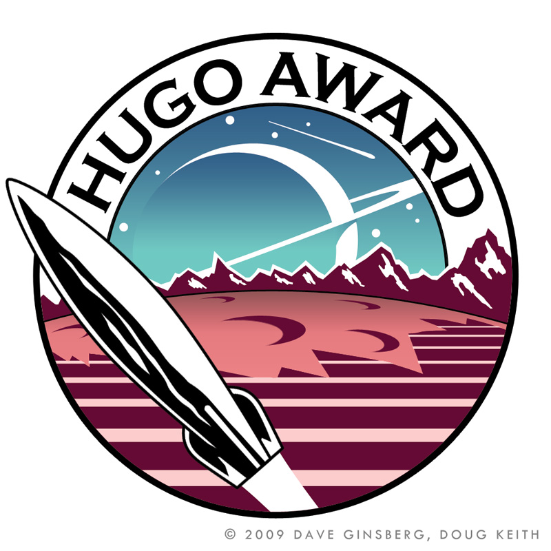
This design is a collaboration with accomplished children's book illustrator, Doug Keith. It is a circular medallion with the words "Hugo Award" across the top written in Copperplate Gothic Bold font. Artistic license is taken with the proportions of the Hugo rocket which soars up at an angle from the shadow of a range of extraterrestrial mountains that surrounds the cratered surface. The background is a nod to Chesley Bonestell's painting, "Saturn as Seen from Titan".
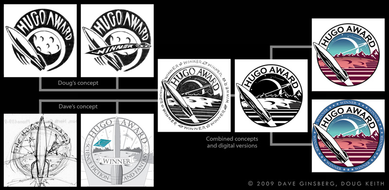
Doug and I put most of our effort into the concept shown here. We spent about a week trying out a few alternatives. We combined our favorite parts from each one, then worked the final design pretty hard for another two weeks. The evolution of the design is shown below.

photoshop
2009

Concept 2
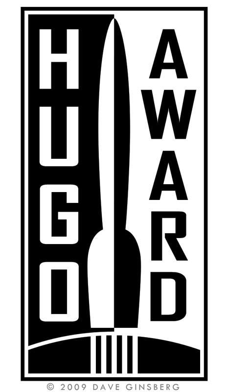
The design below is a vertical concept that places a split silhouette of the Hugo rocket in the center above the curve of a planet. Straight vertical lines represent the rocket exhaust.
The words "Hugo Award" straddle the rocket on the contrasting black and white background.
The word "winner" replaces the rocket exhaust on the winner's variant.

photoshop
2009
Concept 3
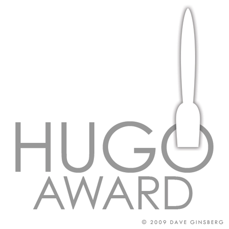
For this design, I went with a bare bones approach. Only the elements specified in the rules are included.
People that see this say that it has an Art Deco look. Century Gothic font is used for the gray text. A back-shadowed silhouette of the Hugo rocket rises from the circle formed by the 'O'.
"Winner" is added at the bottom of the winner's variant.

photoshop
2009


